For a future update
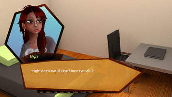
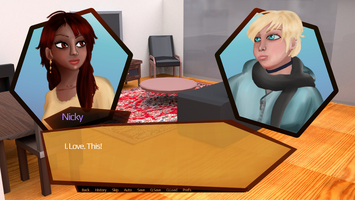
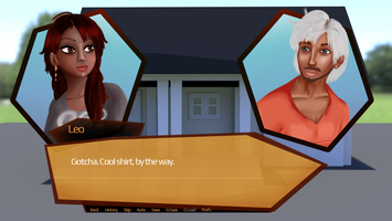
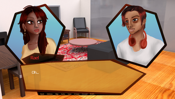
**Just to be clear, this isn't happening any time soon.
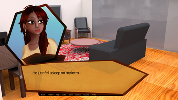
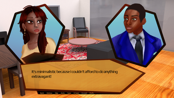
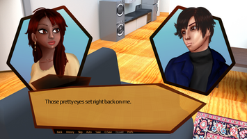
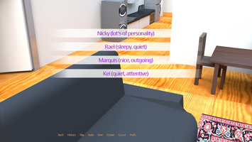
Hello all you lovely people following the development of this game. One of the things I realized after releasing this demo was that trying out a new style for my sprites was a terrible idea.
This is a sketch of the cast all together (done before I made the sprites)
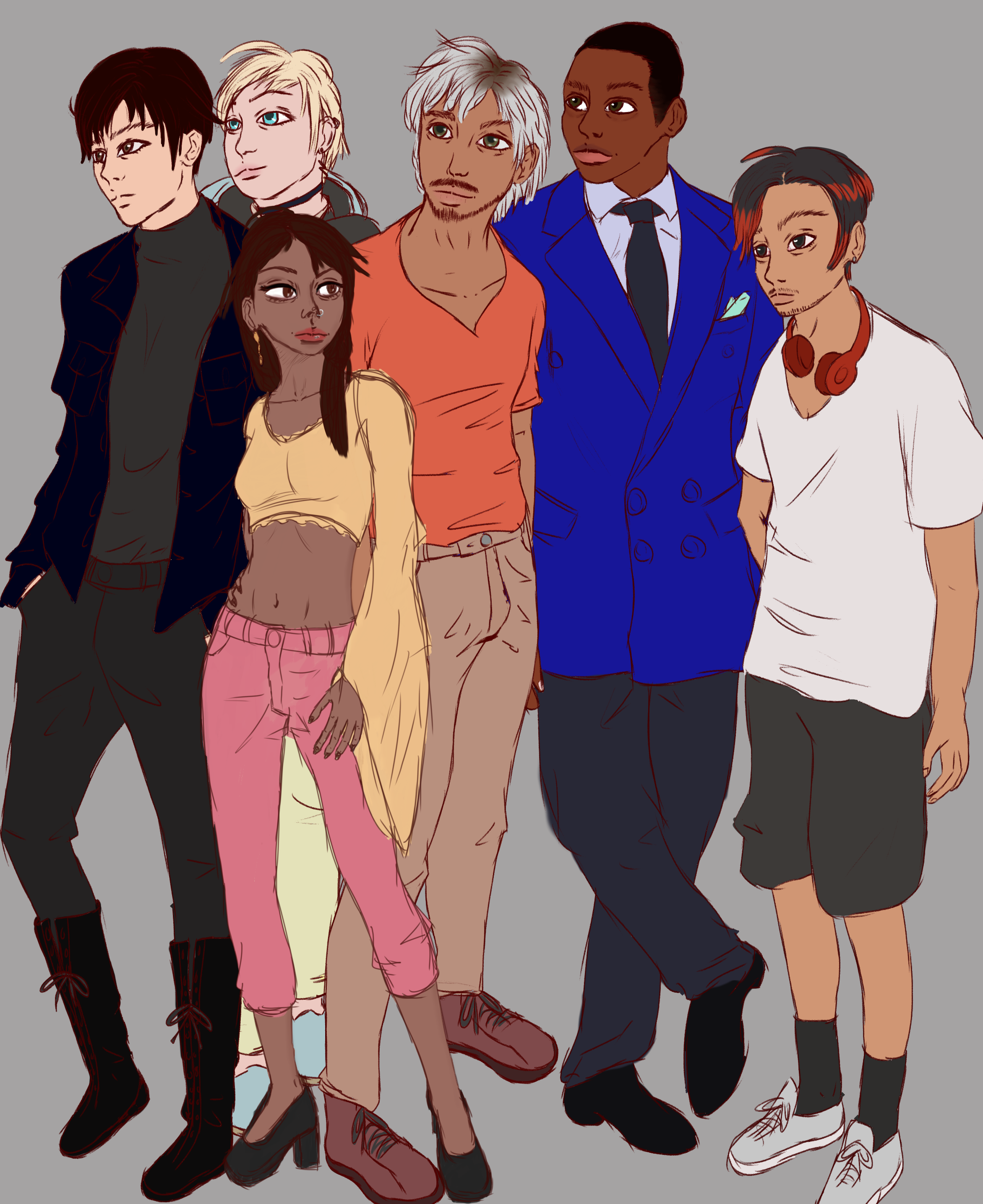
For the most part, everyone looks pretty okay.
So when I begin to replace the sprites (which will happen...eventually...) I'll probably stick to the appearances they have here, but have proper line art while still giving it a slight painted style. I think going full painted was a bad idea. Everyone except the MC looks terrible (this is just my opinion.)
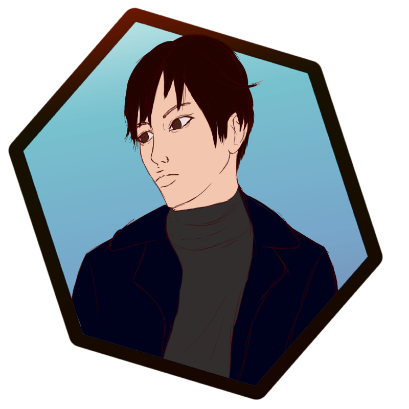
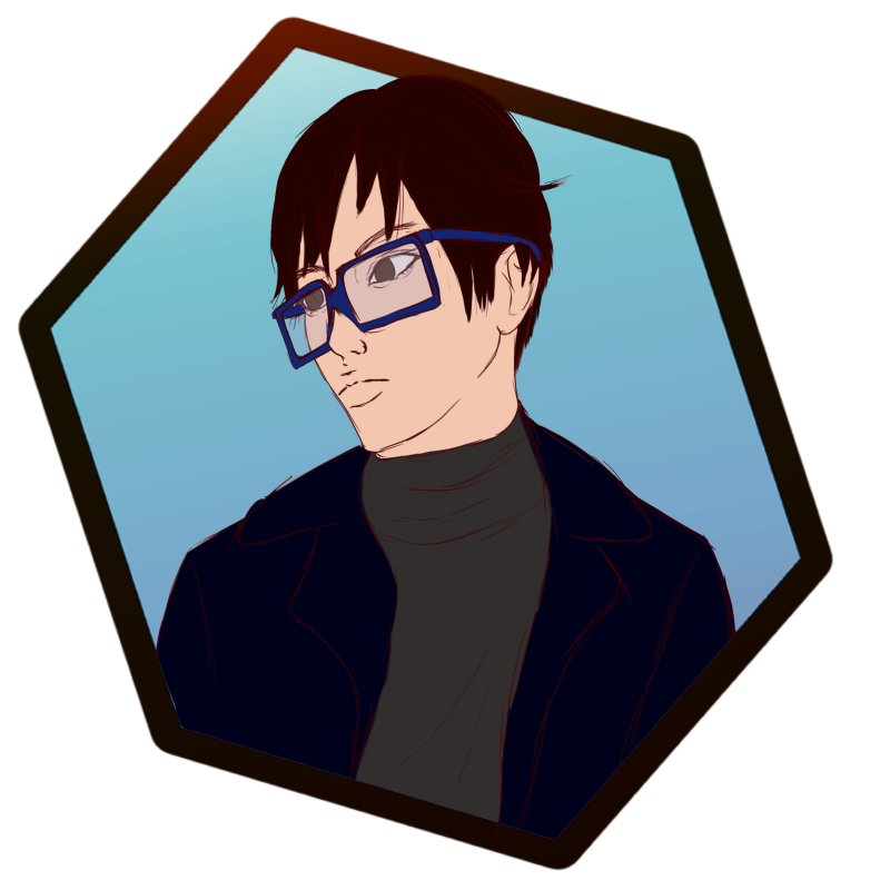
The other day I did sketches of my pretty boy, Kei, and I think he looks much better this way. But what are your thoughts? New sprites a good idea? Should I ditch the painted style entirely and do something more anime-like in terms of shading? Ditch shading all together and just have flats ?(I would love that, not gonna lie, lol)
Files
Get Now Acceping: Roommate [Demo]
Now Acceping: Roommate [Demo]
A slice-of-life about finding the perfect roommate, and possibly love
| Status | In development |
| Author | Lehxra |
| Genre | Interactive Fiction, Visual Novel |
| Tags | 2D, 3D, Dating Sim, Female Protagonist, Meaningful Choices, Multiple Endings, Otome, Ren'Py, Slice Of Life |
More posts
- Leo (but it's a wip)Feb 02, 2021
- RaelJan 11, 2021
- MarquisJan 08, 2021
- KeiJan 07, 2021
Comments
Log in with itch.io to leave a comment.
really hope to see some updates or dev logs on this :)
Thanks for taking a look at my project!
I'm giving my older one's more attention right now, especially Black Diary, but I'll at least start to update the character sprites in the near future.